
Role
Lead Designer
Phase 1
phase 2
Company
HeyJobs
Overview
tl;dr
A research-led rebranding of the HeyJobs talent platform transformed a generic visual identity into a strategic product system. The process involved treating brand values as testable hypotheses, validating visual routes through multi-stage focus groups, and securing executive alignment for a systemic overhaul. The final phase resulted in a revamped design system and established a foundation for authentic storytelling and product growth.
Context
Identity & System Architecture
HeyJobs is a talent platform for essential workers, a high-churn, trust-sensitive audience. The platform had outgrown its original visual identity; a generic aesthetic and stock-heavy imagery were eroding credibility. Simultaneously, the design system had become fragmented, leading to component drift that hindered scalability and accessibility.
PROBLEM
The existing identity suffered from two parallel failure modes:
Process
Cross functional ideation
The project launched with a shared mandate between Product Design and Marketing to define a new emotional and functional territory for the brand. This collaborative alignment was critical to ensure the identity functioned seamlessly across both top-of-funnel marketing assets and deep product experiences.
Discovery & Benchmarking
Extensive market auditing revealed a recruitment landscape dominated by "corporate-cool" aesthetics. This confirmed the need for a radically different, "at-eye-level" approach to better resonate with essential workers.
Collaborative Workshops
Teams paired in intensive brainstorming sessions to translate abstract mission statements into tangible visual principles.
Concept Refinement
Through internal critiquing, heat-mapping, and voting, dozens of ideas were distilled into three high-fidelity visual routes: MetaBall, HeyPulse, and No Edges. These served as the distinct hypotheses for the subsequent user validation phase.

Research & Validation
We moved beyond internal aesthetic preferences, treating brand values as testable hypotheses.
Phase 1: Value alignment
We started with quantitative ranking survey to test candidate brand values - Fairness, Helpfulness, and Empowerment - against what jobseekers actually prioritised.
"Helpfulness" emerged as the highest-leverage trait
Users wanted practical, tangible support - not abstract empowerment. This confirmed the brand needed to feel like a partner, not just a platform. It also eliminated "Empowerment" as the lead message, which had been a popular internal preference.
Phase 2: Qualitative focus groups
We evaluated three visual directions: Metaball (structured/clear), HeyPulse (energetic/vibrant), and No Edges (organic/soft), in a focus group setting.
Groups 1
Under 40 • 8 participants
Groups 2
Over 40 • 8 participants
Group 3 (corrective round)
Age range 19-56 • 7 participants
The initiation of a women-only focus group corrected an early lack of female representation, preventing a significant brand misalignment regarding motion and association.


Metaball as the Lead Direction: Across initial groups, the "Metaball" route demonstrated a "slow-burn" dynamic, earning higher trust over time. In the Over-40 demographic, it averaged 8.125/10, described as "clear, structured, and confident," while competing routes were viewed as "chaotic" or dated.
Critical Adjustments: Participants flagged stylised photography and specific bubble elements as distractions. Based on this feedback, imagery was updated to be more authentic and claims were streamlined before final testing.
Phase 3: Claim testing
We used Maze to test slogans for emotional resonance and clarity. Quantitative scores across the leading candidates were close - the differentiator was qualitative sentiment.
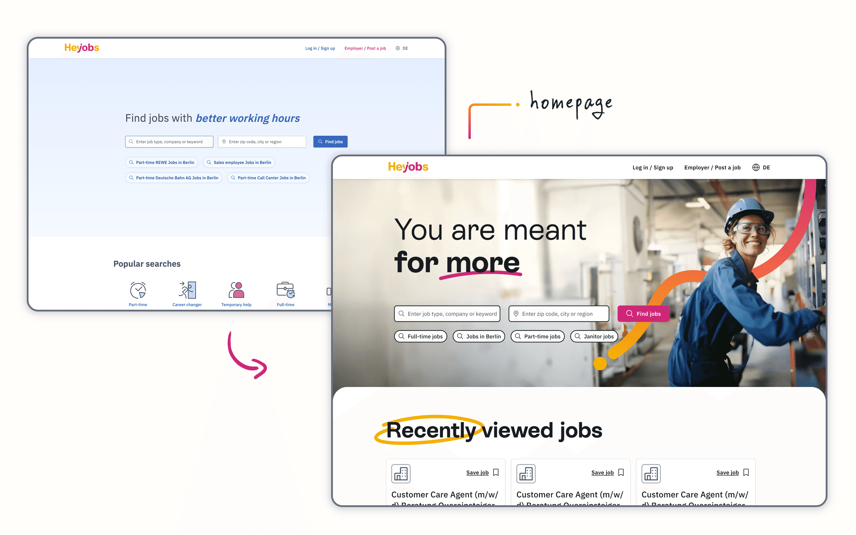
Selected claim: "Du bist gemacht für mehr" - You are meant for more.
This affirmed a belief without prescribing a narrative. It stayed aspirational without being exclusive - addressing the tension surfaced in focus groups, where an earlier "job to calling" framing resonated with some but alienated those who simply wanted good work, not a life narrative.
The verbal identity shifted from transactional to personal.
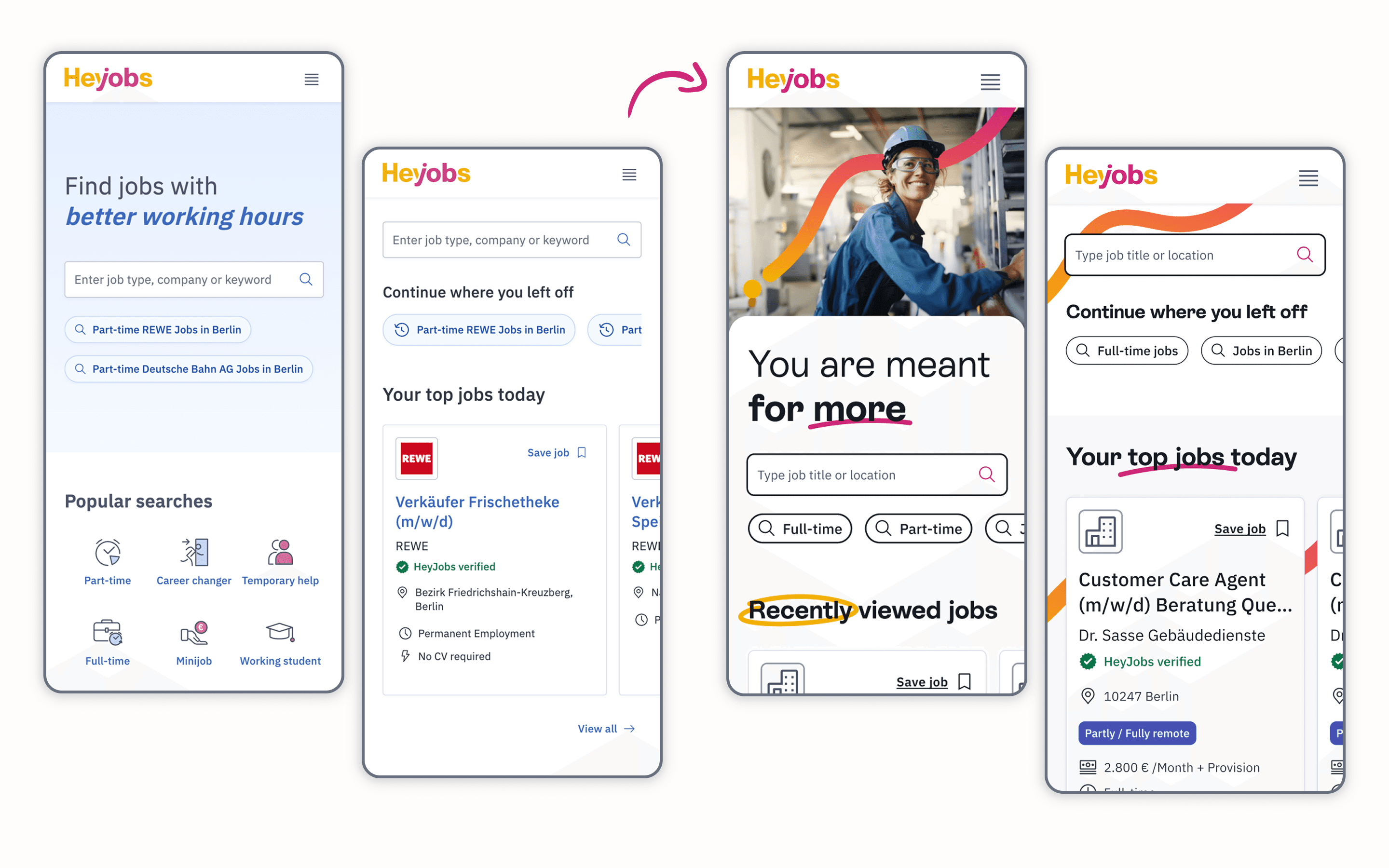
Solution
Design vision
Research gave us a coherent brief: the brand needed to feel authentic, warm, and on eye-level with the user. We defined following visual elements as the core of the new brand:
Imagery
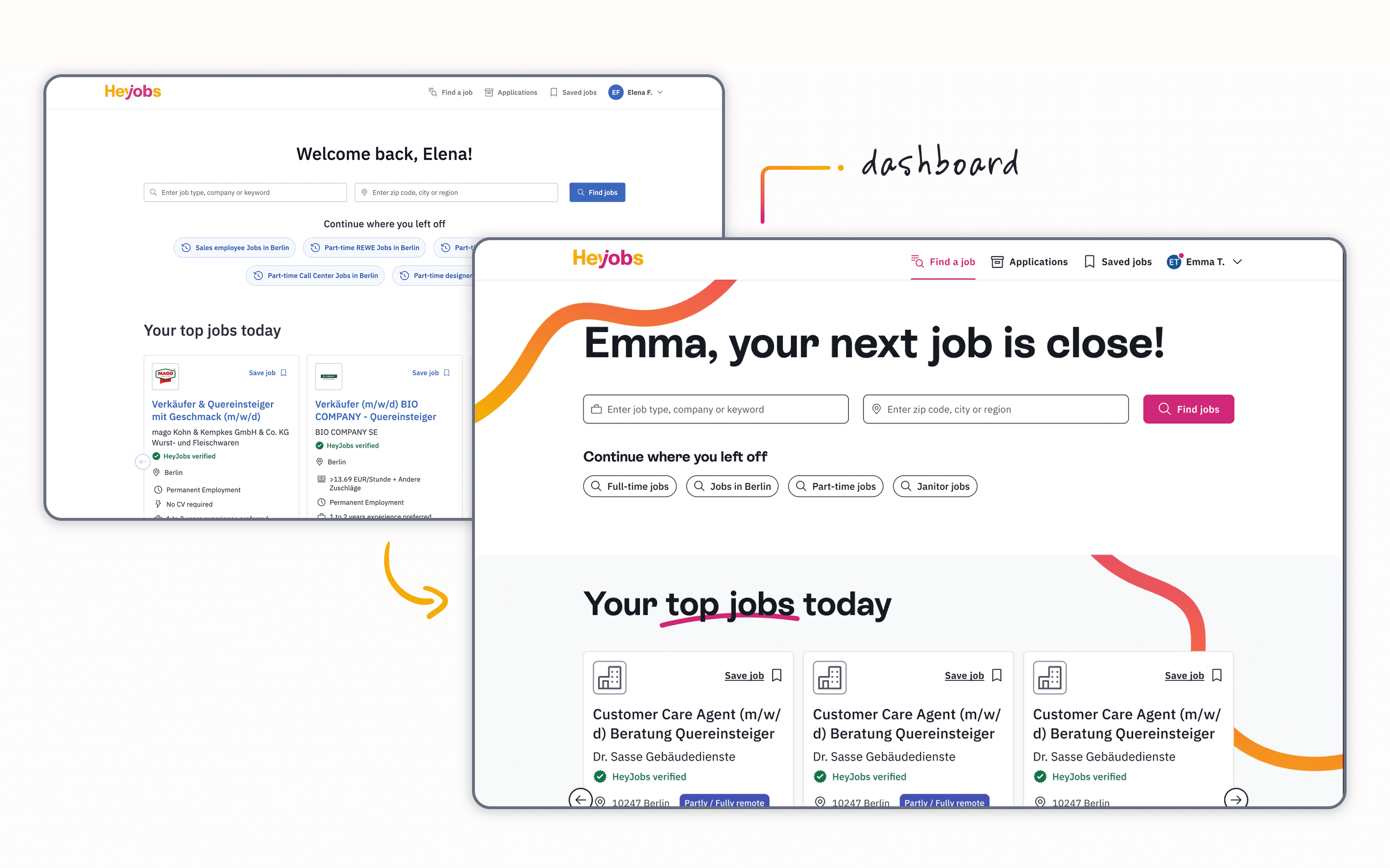
Moving away from polished stock photography, the system employs un-staged imagery of real people in their daily work environments. This captures authentic stories and energy through a candid, documentary-style approach, effectively differentiating the brand from competitors.


The "Lifeline" Motif
A graphic element - a continuous line - serves as a functional and visual signature throughout the product journey. This element connects design components, shapes iconography and navigates users through the HeyJobs experience, ensuring the interface is both memorable and recognisable.
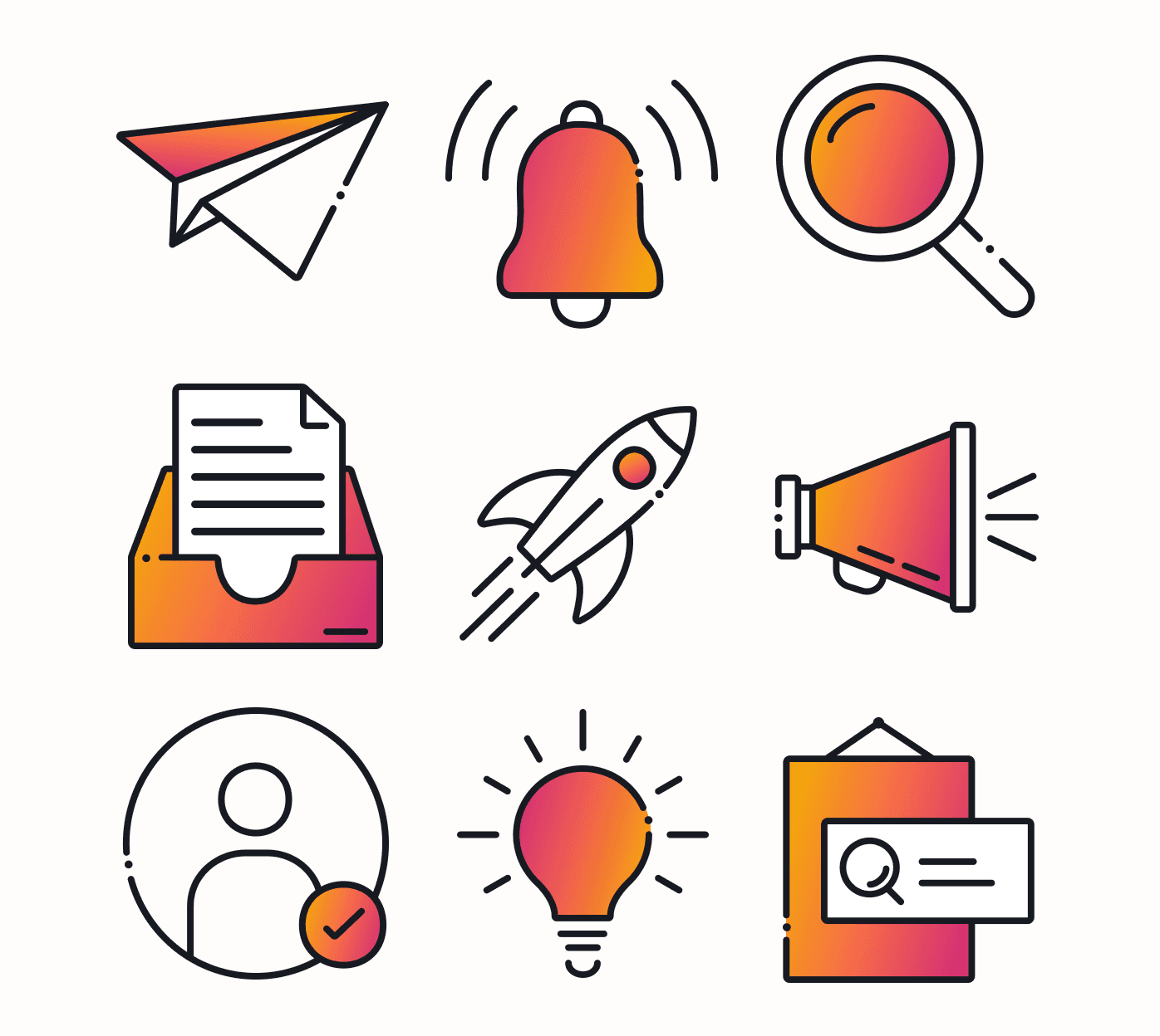
Iconography
The updated illustration style introduces greater complexity and a more sophisticated use of line. By integrating the lifeline with a gold-to-cosmo gradient, the design gains added dimension, highlighting the user's progressive journey.
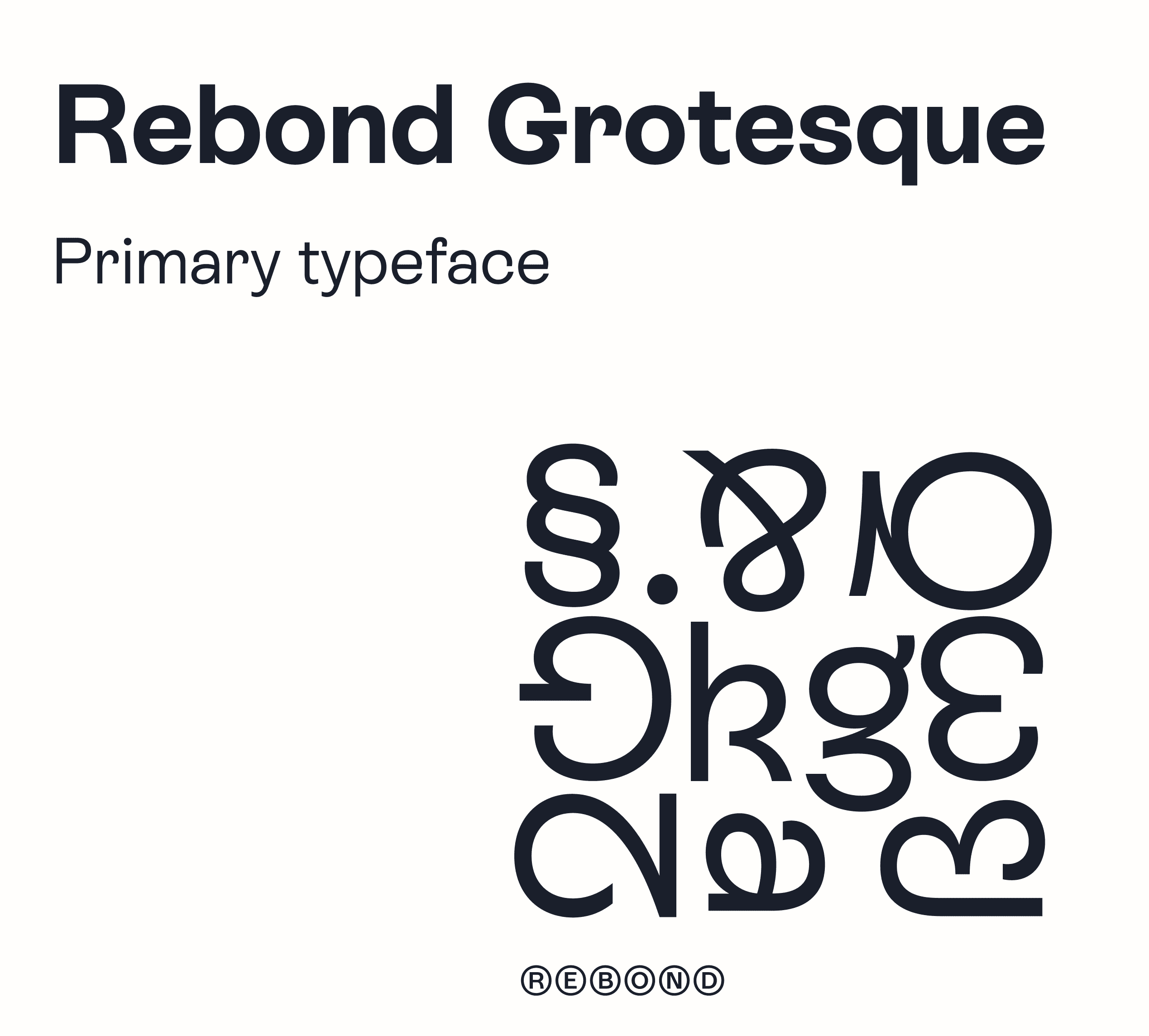
Typography
ES Rebond Grotesque serves as the primary typeface, paired with IBM Plex for functional UI contexts. Rebond delivers warmth and personality without sacrificing legibility, which is critical for less digitally-fluent users and essential for maintaining WCAG compliance for the 40+ demographic.
Scribbles
Sparingly used doodles underline key messages to add a touch of playful emphasis. These elements introduce a personal, approachable layer to the communications, strengthening the human connection between the brand and its customers.

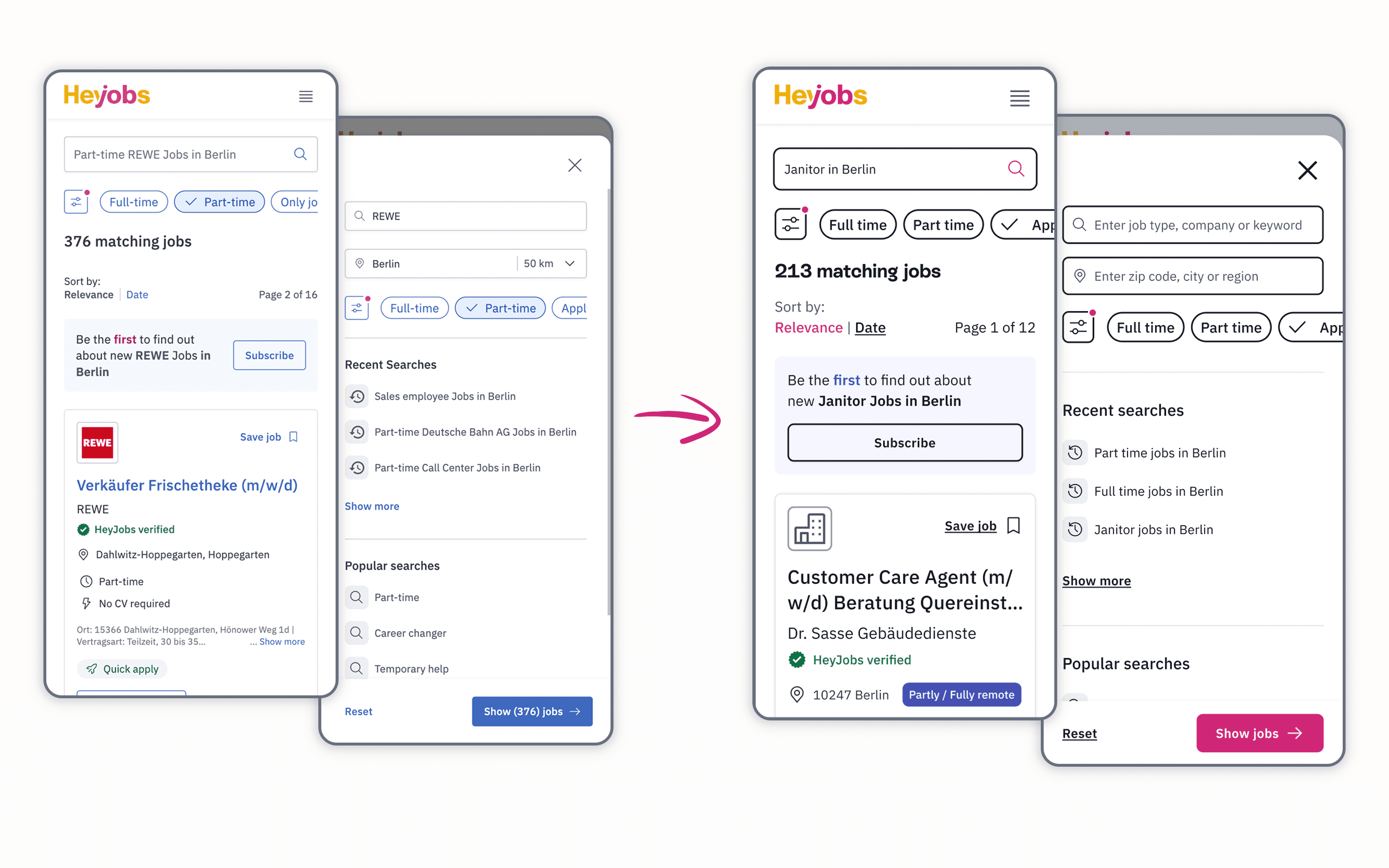
Design System & Product Redesign
Once the direction was signed off, I took the ownership of the design system's technical transformation.
Colour Mapping: Instead of a rebuild, the new brand colours were mapped directly onto the existing atomic structure. Because the system was already built using atomic principles, the transition was efficient and maintained structural consistency.
Legacy Clean-up: Prior to the rebranding, a comprehensive audit and clean-up of the codebase were performed to fix previous development mistakes and inconsistencies. This ensured a stable foundation before the new visual identity was applied.
Interaction & Component States: Specific animations and interactive component states were updated in collaboration with engineers to match the new visual language.
Asset Optimisation: Photography and visual assets were optimised for product use, balancing image quality with technical performance and load times.
Accessibility Check: New colour palettes and typography were tested to ensure the system remained readable and met standard accessibility requirements.
Scope negotiation
The initial engineering estimate for a full component rebuild was 160 storypoints - competing directly with features on the product roadmap. Rather than defending that number or accepting a watered-down result, I collaborated with Frontend Leads to redesign the scope itself: mapping every change against business impact vs. engineering effort and stripping to the High-Impact / Low-Effort core.
Before & After
Compare the previous interface with the redesigned experience. This section highlights the transition to a more intuitive, human-centric journey by streamlining core tasks and refining the visual hierarchy.


IMPACT
Strategic Impact
This evolution ensures the visual identity and messaging accurately reflect the current mission while providing the flexibility required for future growth. By establishing a unified presence, the system provides a foundation for more authentic storytelling and a more cohesive user experience across every touchpoint.
Trust & Recognition
The update ensures immediate market recognition and fosters a strong, trustworthy brand image that resonates with the essential worker demographic.
Design System Revamp
A systematic update of the component library was executed to align with the new brand identity, ensuring seamless integration across the entire product.
Optimising Design Depth
By resolving usability friction and reducing unnecessary design complexity, the revamp removed systemic bottlenecks, enabling the team to operate at full speed.
Accessibility Standardisation
A comprehensive audit and implementation of fixes were integrated to ensure the system meets WCAG-compliance and remains inclusive for all users.