Search Interaction Design

Redesigning the job search experience for a growing audience of mobile-first users - making it faster to find relevant jobs and easier to narrow down results

Role

Lead Designer

Scope

End-to-End: Research to Delivery

Company

HeyJobs

Overview

tl;dr

HeyJobs’s search engine had outpaced its interface, leaving mobile users struggling to find relevant roles. Following two rounds of research (19 participants), we discovered that result quality, not filter complexity, was the primary pain point. I designed a mobile-first search experience, featuring a full-screen modal, scrollable quick filters, and live result counts, that successfully shifted user behaviour from manual keyword typing to intuitive filter browsing.

Key Impact

63% → 55%

Reduction in manual query input (behaviour shift)

+140%

'Working hours' filter usage

+700%

'Easy apply' filter usage

~2.1M

Monthly search interactions (up from 1.8M)

+140%

'Working hours' filter usage

63% → 55%

Reduction in manual query input (behaviour shift)

+700%

'Easy apply' filter usage

~2.1M

Monthly search interactions (up from 1.8M)

context

Why search & filtering?

HeyJobs serves essential workers, a segment that is overwhelmingly mobile-first and job-hunts on the go. The existing desktop-centric search experience failed to meet the needs of this audience, who rarely use traditional filters as a primary navigation tool.

For talent

Faster access to relevant results through intuitive browsing, a search experience that prioritises result quality over filter complexity.

for heyjobs

Higher engagement, lower drop-off, and increased applications, especially on mobile where the majority of traffic originates.

For talent

Faster access to relevant results through intuitive browsing, a search experience that prioritises result quality over filter complexity.

for heyjobs

Higher engagement, lower drop-off, and increased applications, especially on mobile where the majority of traffic originates.

PROBLEM

Experience built on assumptions

Search is the core of the HeyJobs experience.
A major backend upgrade had significantly improved the quality of our results - but users couldn’t tell. They were navigating an interface designed for a different era, one that assumed they knew exactly what to type and penalised anyone who didn't.

Two types of users were struggling in different ways:

Deep searchers

Goal

To pinpoint a specific role using precise criteria.

To pinpoint a specific role using precise criteria

Pain

They couldn't refine results without digging through a overwhelming filter panel

Broad searchers

Goal

To explore different career options and discover roles.

To explore different career options and discover roles

Pain

They had no obvious starting point or help once they landed on a page full of results

Deep searchers

Goal

To pinpoint a specific role using precise criteria.

Pain

They couldn't refine results without digging through a overwhelming filter panel

Broad searchers

Goal

To explore different career options and discover roles.

Pain

They had no obvious starting point or help once they landed on a page full of results

Since the majority of our users are on mobile, these UI flaws were magnified:

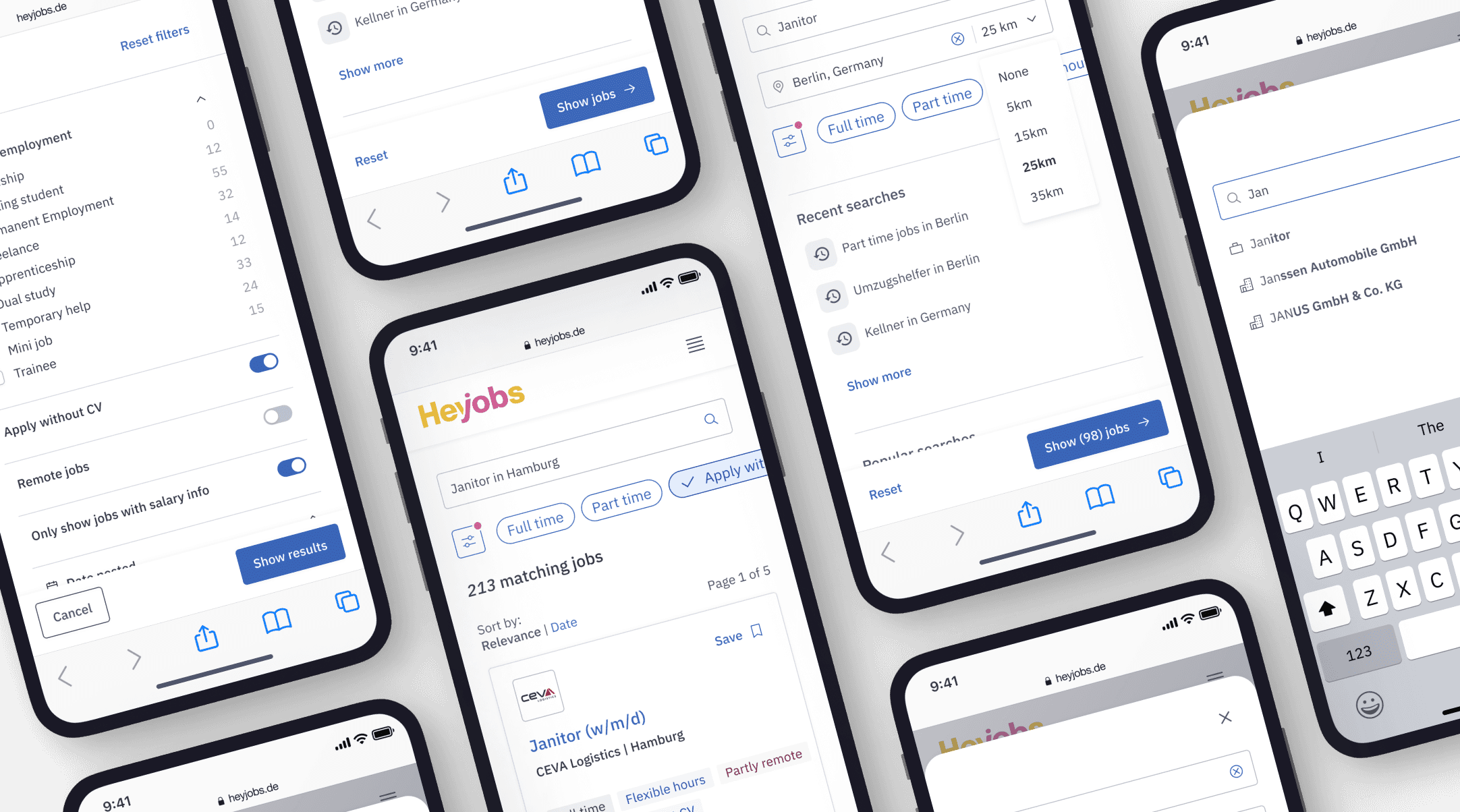
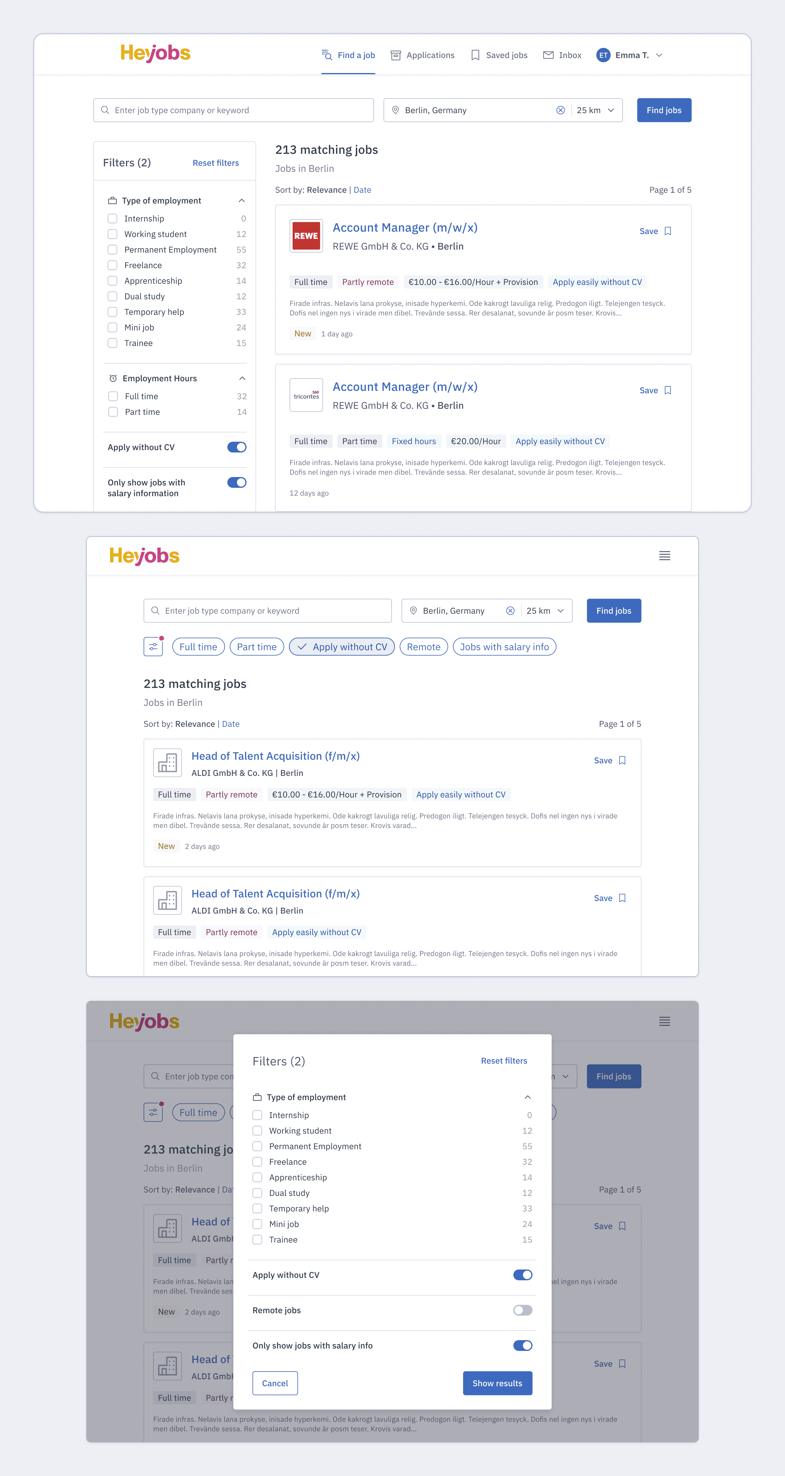
  • Screen Hogging: The search form dominated the screen even when users were just browsing

  • Irrelevant Logic: The radius filter appeared regardless of whether a location had been entered

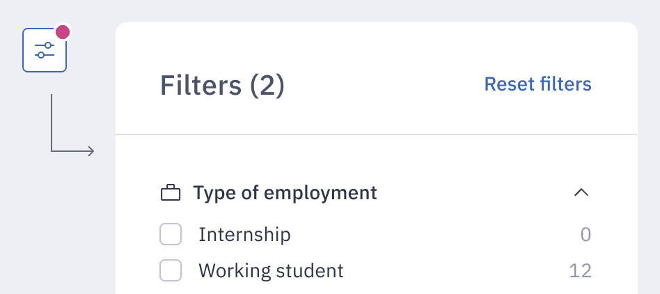
  • Invisible States: Filters were hard to discover, and active states were invisible, making it impossible to see what was currently narrowing the results

Process

Research & Design

Following our Lean UX process, we ran two rounds of ideation and validation - each building directly on what we learned from the last.

Round 1 Discover & Respond

13 participants · Remote usability testing · Mixed age range, 24–60

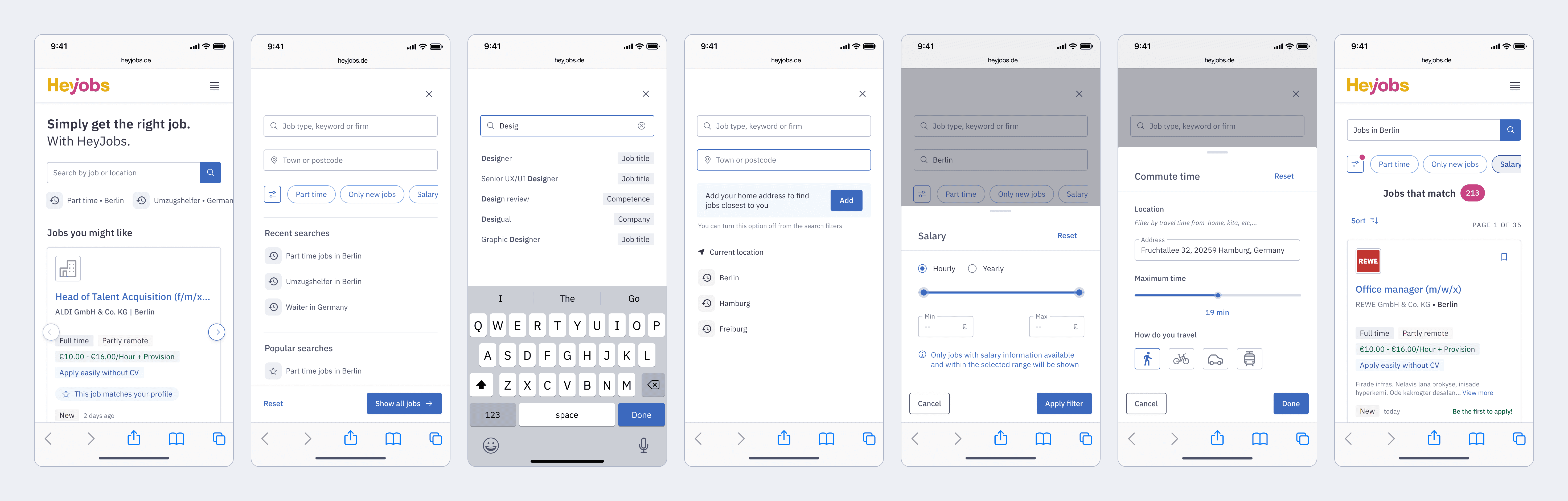
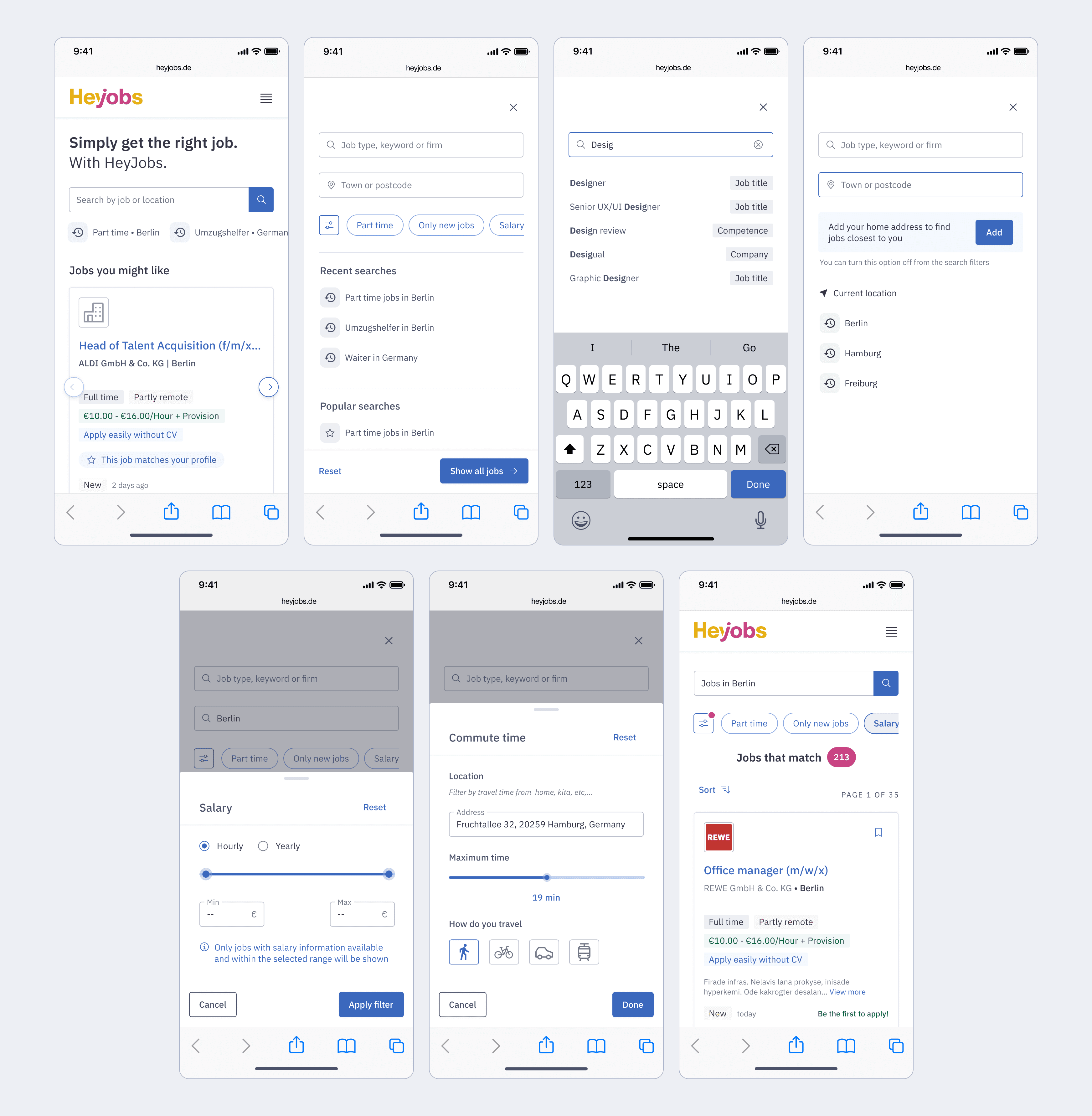
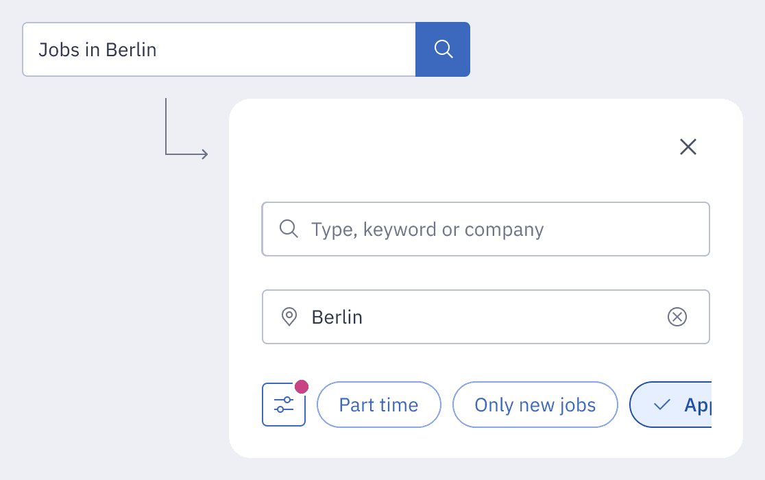
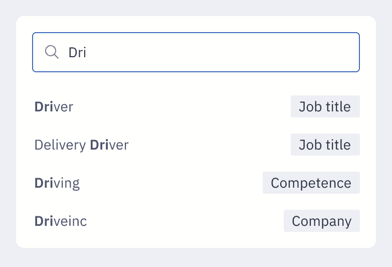
We observed participants searching on competitor sites and our site in a natural setting, then had them test a prototype with full-screen search, quick filters, and an extended filter panel.

The single most important finding from this rounds was simple:

"Most important to participants was the quality of the search result. If the results don't fit, they would usually quit, without refining the search."

If results didn't match intent, users left - without ever touching a filter. This reframed our entire focus: filter improvements only matter if search quality is already working.

  • Search vs. Filter: Filter usage was only 5%, as users preferred scanning results. Full-screen search, however, was adopted immediately and intuitively.

  • Clarity Issues: Quick filter active states were unclear for the majority, and advanced filters suffered from low discoverability.

  • User Priorities: Location and job type were the most utilised categories, while recent searches were specifically requested to reduce friction.

Armed with these findings, we began exploring new interaction patterns. The goal was to establish structural patterns, how components would behave individually and together.

key questions

Full-screen modal

How should it trigger, and what lives inside it?

Autosuggest

How does it visually differentiate job titles from company names?

Quick filters

How many visible by default, and which ones?

Filter transitions

How do we move between quick search and advanced filters without losing context?

Round 2 Refine & Validate

6 participants · remote usability testing · Mixed age range, 24-45

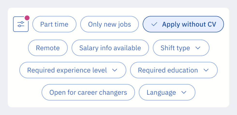
We focused this round on the refined designs - specifically the scrollable quick-filter strip and full-screen search with autosuggest - combined with an new feature 'Quick Apply' to observe how the two flows interacted.

Overall the design was perceived very well:

  • Consistent Intuition
    Full-screen search remained the primary, intuitive entry point for all participants, validating the core navigation model.

  • Effective Visual Affordance
    The "visual cut-off" on the filter strip successfully prompted horizontal scrolling, making the full range of quick filters discoverable.

  • Improved Clarity
    Active filter recognition increased significantly, and advanced filters were easily located and used without friction.

User Requirements

The two rounds converged on a clear priority order - the foundation for every decision we made in the final design.

#

User need

Why it matters

1

Full-screen search on mobile

Confirmed across both rounds - must ship

2

Quick filters

Visible, scrollable, clear active states

3

Recent searches

Low-friction return path for repeat users

4

Live job count

"X jobs match" - reduce uncertainty while filtering

5

Radius filter

Only when location is set

6

Autosuggest

Differentiate job titles from companies clearly

#

User need & why it matters

1

Full-screen search on mobile

Confirmed across both rounds - must ship

2

Quick filters

Visible, scrollable, clear active states

3

Recent searches

Low-friction return path for repeat users

4

Live job count

"X jobs match" - reduce uncertainty while filtering

5

Radius filter

Only when location is set

6

Autosuggest

Differentiate job titles from companies clearly

With the user requirements prioritised and stakeholder buy-in secured, I refined the final interaction patterns and paired with the Front-End team to define the component logic and implementation details, ensuring the design was ready for production.

SOLUTION

What we shipped

The final design introduced or redesigned ten components for the search page. Beyond the mobile overhaul, updates were applied across all breakpoints to leverage the new component library and ensure a cohesive experience.

New

Full-Screen Search Modal

Opens when a user taps any search field on mobile. Includes job title input, location, radius, quick filters, recent searches, popular searches, and a "Show X jobs" button.

New

Quick Filter Strip

A horizontally scrollable strip beneath the search bar. 2–3 options visible by default with a visual cut-off. Tapping applies immediately.

New

Recent Searches

Previous queries shown in the full-screen modal. Directly requested by 4/13 users in Round 1 research.

Redesigned

Autosuggest UI

Suggestions now clearly differentiate job titles from company names. Triggers after the 2nd keystroke. Max suggestions increased from 5 to 10.

Redesigned

Radius Filter

Only appears after a location has been entered. Previously always visible, creating noise for users who hadn't set a location.

New

"X Jobs Match" Badge

Live count updated dynamically as filters are applied. Gives real-time feedback so users know what to expect before committing.

IMPACT

Validation & Results

Validated through an A/B test with 33,425 users (95% significance), then rolled out to 100% traffic two months later.

Filter usage: The core shift

Filter

Before

After

Change

Working Hours

~10%

~24%

+140%

Easy Apply

~0.3%

~2.4%

+700%

Salary

~1.5%

~3.5%

+133%

Filter

Before

After

Change

Working
Hours

~10%

~24%

+140%

Easy Apply

~0.3%

~2.4%

+700%

Salary

~1.5%

~3.5%

+133%

Behavioural Change

Lower Search friction

Query input usage dropped by 8pp (63% → 55%) - users shifted from typing to filtering.

Increased Exploration

Monthly search interactions rose from ~1.8M to ~2.1M, suggesting users were browsing more deeply

Lower Search friction

Query input usage dropped by 8pp (63% → 55%) - users shifted from typing to filtering.

Increased Exploration

Monthly search interactions rose from ~1.8M to ~2.1M, suggesting users were browsing more deeply

Primary Metric

Job card clicks per session, bounce rate, and conversion from search to application showed no significant change. But that's the point: filter-driven feeds performed comparably to query-driven ones - which validated the whole premise. Broad Searchers using filters were getting to relevant jobs just as effectively as Deep Searchers typing queries.

© 2026 Elena Franković

© 2026 Elena Franković

© 2026 Elena Franković